Data visualization in R

Introduction
In our data driven world the visualization of data is an essential skill in order to transport meaningful messages. It allows us to go beyond the mere analysis of data for the sake of analysis. The following collection of visualizations in R using ggplot are a representation of my work at London Business School in the process of enhancing my skills in the field. I will regularly add new visualizations going forward.
“The ability to visualize data in a meaningful way keeps us focused on the ‘So what?!’ of our analysis.”
Brexit voting behaviour
In the following section we will visualize the 2016 Brexit vote data in the UK. Specifically, we show how the political addiliation int he 2015 UK general election translated into Brexit voting.
The data
The data comes from Elliott Morris, who cleaned it and made it available through his DataCamp class on analysing election and polling data in R. It provides the voting results to leave the EU for UK parliament constituencies.
The process
First, we load the dataframe…
brexit_results <- read_csv(here::here("data","brexit_results.csv"))Let’s have a look at the dataframe…
# Glipmse the first data rows in order to check data structure
check_brexit_results <- head(brexit_results, 10)

check_brexit_results %>%
  # Use Kable package in order to transofrm into nice table
  kbl(col.names = c("Seat", "Con_2015", "Lab_2015", "LD_2015", "Ukip_2015", "Leave_share (%)", "Born_in_UK", "Male", "Unemployed", "Degree", "Age_18to24")) %>%
  kable_material_dark() %>%
  kable_styling(fixed_thead = T, full_width = F, font_size = 14) %>%
row_spec(0, background = "#363640", color = "white")| Seat | Con_2015 | Lab_2015 | LD_2015 | Ukip_2015 | Leave_share (%) | Born_in_UK | Male | Unemployed | Degree | Age_18to24 |
|---|---|---|---|---|---|---|---|---|---|---|
| Aldershot | 50.6 | 18.3 | 8.82 | 17.87 | 57.9 | 83.1 | 49.9 | 3.64 | 13.87 | 9.41 |
| Aldridge-Brownhills | 52.0 | 22.4 | 3.37 | 19.62 | 67.8 | 96.1 | 48.9 | 4.55 | 9.97 | 7.33 |
| Altrincham and Sale West | 53.0 | 26.7 | 8.38 | 8.01 | 38.6 | 90.5 | 48.9 | 3.04 | 28.60 | 6.44 |
| Amber Valley | 44.0 | 34.8 | 2.98 | 15.89 | 65.3 | 97.3 | 49.2 | 4.26 | 9.34 | 7.75 |
| Arundel and South Downs | 60.8 | 11.2 | 7.19 | 14.44 | 49.7 | 93.3 | 48.0 | 2.47 | 18.78 | 5.74 |
| Ashfield | 22.4 | 41.0 | 14.83 | 21.41 | 70.5 | 97.0 | 49.2 | 4.74 | 6.08 | 8.21 |
| Ashford | 52.5 | 18.4 | 5.98 | 18.82 | 59.9 | 90.5 | 48.5 | 3.69 | 13.12 | 7.82 |
| Ashton-under-Lyne | 22.1 | 49.8 | 2.42 | 21.76 | 61.8 | 90.7 | 49.2 | 5.11 | 7.90 | 8.94 |
| Aylesbury | 50.7 | 15.1 | 10.62 | 19.71 | 51.8 | 87.0 | 49.5 | 3.39 | 17.80 | 7.56 |
| Banbury | 53.0 | 21.3 | 5.93 | 13.88 | 50.3 | 88.8 | 49.5 | 2.93 | 16.70 | 7.61 |
As we can observe we have data by constituency, as well as the respective votes (%) by party and the resulting leave share (%). Additionally, we have data about the share of UK born (%) citizens, unemplyoment (%), share of degree holders (%) and share of people aged 18-24.
We intend to visualize a scatter plot showing the relationship between “Party % in the UK 2015 general election” and the Leave % in the 2016 Brexit referendum. In order to do so, we’ll need to manipulate, more specifically pivot our data, so that each constituency has one row with the % of votes related to the particular party affiliation.
Let’s pivot the data …
brexit_results_adjusted <- brexit_results %>%
  # creating an additional column that indicates the percentage of people that didn't vote: will not be used for this particular exercise
  mutate(no_vote = 100-con_2015-lab_2015-ld_2015-ukip_2015) %>%
  # using pivot longer to create a column with the party affiliation as well as the respective percentage of votes
  pivot_longer(cols = c(con_2015:ukip_2015),
               names_to = "Party_vote",
               values_to = "Vote_share") %>%
  # renaming the values to be more descriptive
  mutate(Party_vote = case_when(
    Party_vote == "con_2015" ~ "Conservative",
    Party_vote == "lab_2015" ~ "Labour",
    Party_vote == "ld_2015" ~ "Lib Dems",
    Party_vote == "ukip_2015" ~ "UKIP"
  ))
Let’s visualize …
#brexit_results_adjusted
ggplot(brexit_results_adjusted,  aes(x = Vote_share, y = leave_share, colour = Party_vote)) +
  geom_point(alpha=0.35) +
  scale_y_continuous(limits = c(20,100)) +
  scale_colour_manual(values = c("#0087dc", "#d50000", "#FDBB30", "#EFE600")) +
  # using geom_smooth using the linear method we add a linear trend line to the plot
  geom_smooth(method = "lm") +
  labs(title = "How political affiliation translated to Brexit Voting", x = "Party % in the UK 2015 general election", y = "Leave % in the 2016 Brexit referendum") +
  theme(panel.grid.major = element_line(colour = "#f0f0f0"),
        panel.background = element_rect(colour = "black", size=0.5, fill = NA),
        legend.key = element_rect(colour = "transparent", fill = "transparent"),
        legend.position = "bottom",
        legend.title = element_blank())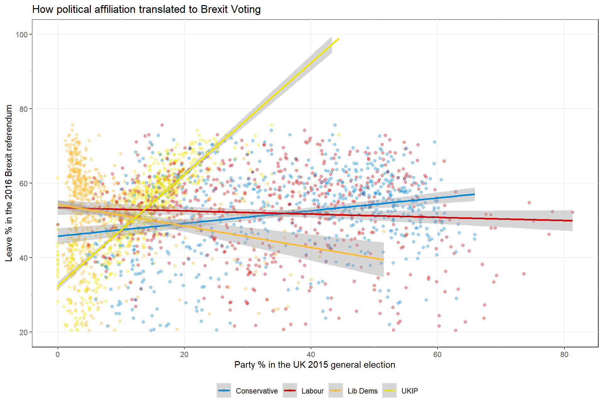
The interpretation
Looking at visualized data we can see that there seem to be clear differences in party affiliation of constituencies and the resulting voting behaviour regarding Brexit. As can be observed based on the linear trend lines, constituencies with higher share of Ukip votes in the 2015 election had, on average, a higher likelihood to vote for Brexit. Likewise, though with a lower observed correlation, can be observed for constituencies with a higher share of Conservative votes. On the contrary, constituencies with stronger affiliation with the Labour party and Liberal Democrats likely voted against Brexit.
One always has to keep in mind that based on this basic visualization we canot draw definite conclusions regarding the party affiliation and Brexit voting behaviour. While there can be seen clear correlations, further analysis would be required to identify all or at least a high number of varying factors driving Brexit voter behaviour.
Last updated: 20 September, 2020